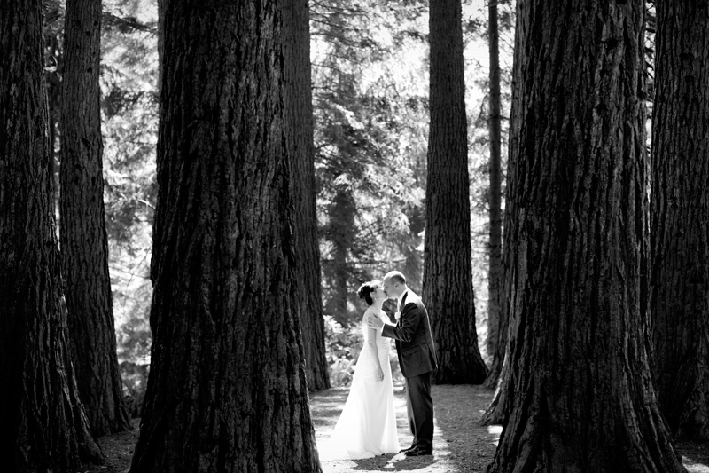
 Photo below by Adm:
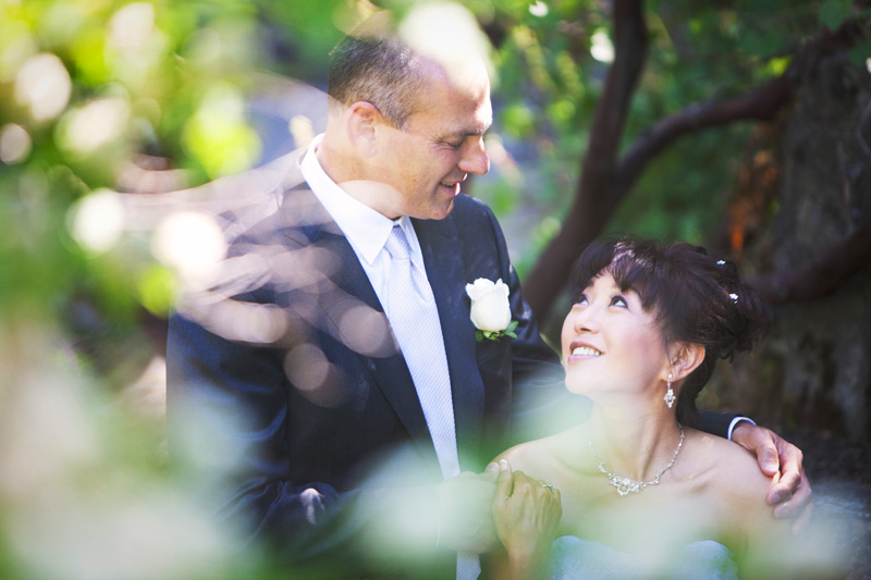
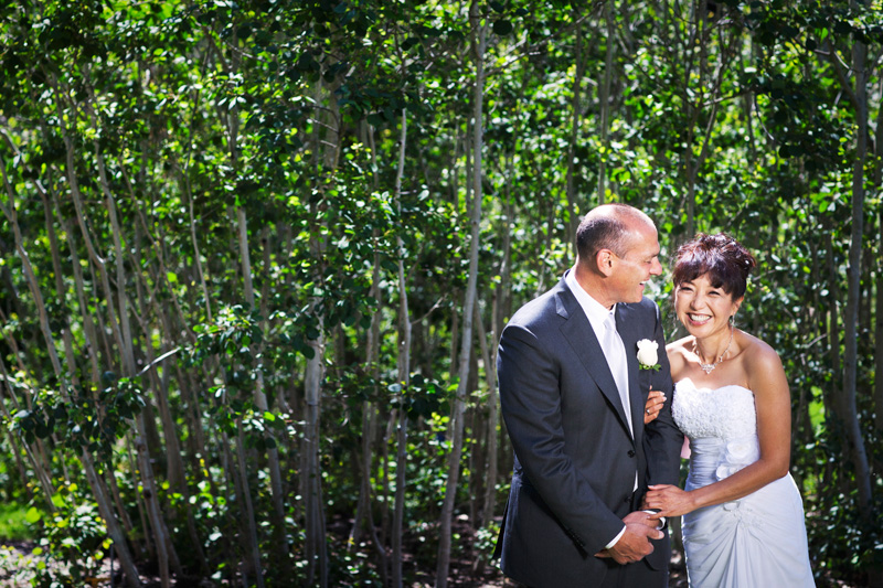
 Photo below by Adm:


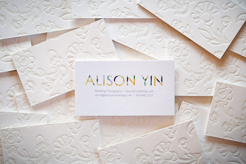 How many times do you receive business cards and put them in your pocket only to find them crumpled and completely chewed up in the washing machine? Well, that's happened to me so many times I've lost count. I am notorious for forgetting to empty my pockets before doing laundry. So, then, what's the point of spending money for nice business cards, you may ask? Well, I wondered that same thing, and here's what I've come up with: my goal of giving someone a business card is to leave an impression with them. I want them to remember that card that's in their pocket and go check out the information that's on the business card, i.e., pull up my web site next time they're on the computer. I'm not leaving stacks of cards at coffee shops hoping that random people will pick them up. I'm selectively giving cards out to prospective clients, other wedding vendors and hopefully wedding bloggers and editors. This means that I need my card to stand out, not only to encourage people to remember it and use it, but also because it's often other people's first impression of my style and aesthetic, and we all know how important first impressions are.
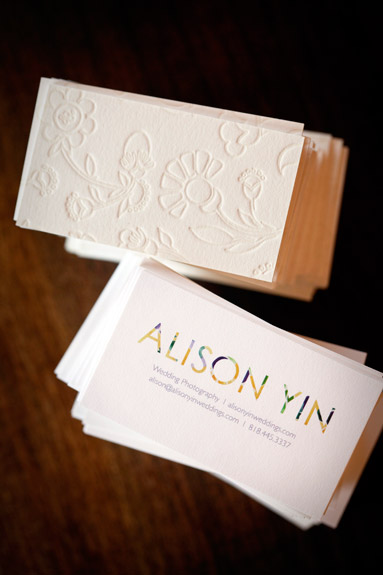
Therefore, Emma and I decided to make a card so thick there's no way someone will forget about it in their pocket. I also read that the more texture your card has, the more of an impression (literally and figuratively) it will make on someone just because they end up touching it more. So, here they are. They were created by Twig and Fig in Berkeley. The back of the card is letterpress with Emma's hand sketched floral illustration, and the front is flat color printed, all on recycled paper stock with soy based inks. Check 'em out:
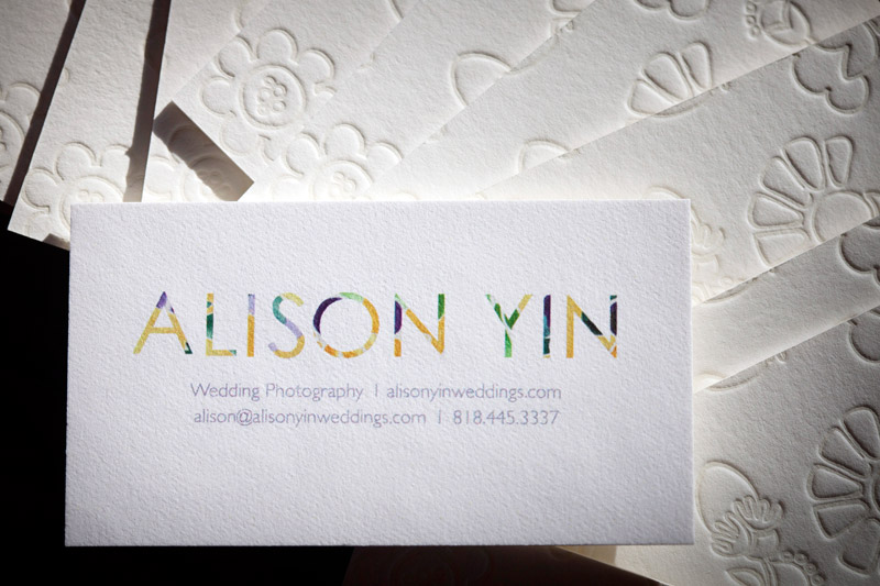

I know I went a little overboard with all the photos, but they are really beautiful, and since most of you can't see them in person, I figured I'd overload you with images. : )
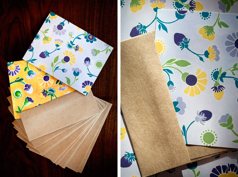
Stationery is up next. I send out handwritten cards to clients and other wedding vendors. Since Emma had created such lovely paintings - the purple one is acrylic and the yellow is watercolor, it was pretty easy to use both as the fronts of my cards. We used the purple painting for flat cards and the yellow painting for folded cards. The cards were printed by Brandes Printing Company, also in Berkeley, and also printed on all recycled paper stock with soy-based inks. I picked up the envelopes from Xpedex Paper Store in Berkeley, and again, they're 100% recycled - do you see a trend here?

Here are the mailing labels that Emma designed. The smaller ones are for the stationery cards - they fold over so that my return address is on the back (Emma is so clever!), and the larger labels are for boxes that I send out. I actually printed these at home on sticker paper and then cut them out. Hooray for DIY!

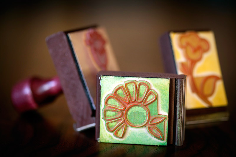
Emma made some stamps for me. You can never have too many stamps, right? I'll use them for all different things - envelopes, labels, boxes, hang tags... there are endless possibilities!
For some reason, I knew from the beginning of this process that I wanted to use fabric flowers to adorn my print packaging. I found a small piece of fabric with almost all of my colors at an independent store in Berkeley, and followed this tutorial on making fabric flowers from 100 Layer Cake. The only missing color in the fabric was yellow, but some bright yellow buttons solved that problem. Unfortunately, the fabric I have is not unlimited and so once I run out, I'll be on the hunt for different fabric. But that's OK, searching for salvaged fabric is part of the fun, and I like that my look can be eclectic and evolving. As an extra benefit, I glued on pin backings to the backs of the flowers so they can double as pins for sweaters, purses, hair pieces....

The photo boxes are probably the most boring part of my packaging. They're 100% recycled Kraft photo boxes from here. I scoured the internet for other interesting and *affordable* options, and to be honest, there's not really a whole lot out there! However, it's more important to have my photos arrive safely and in perfect condition than to arrive bent but in a pretty box. Hopefully with some creative accessorizing, I've spiced them up a bit.
To complete the look, I found beautiful natural wood hang tags that have each been stained by hand with an environmentally friendly wood stain and hand-dyed cotton from this amazing shop in Indiana called Olive Manna. I encourage all crafty brides to check out this shop as there are lots of ideas for DIY wedding pieces.
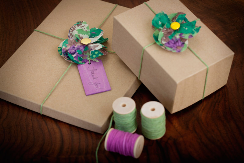


And that's it! The only thing I didn't show is my DVD packaging, which I didn't get around to creating and photographing yet so I'll have to save that for a later post. This is the last of my "identity" series. Like I've said, I had a really fun time working with Emma, who is just so creative, and I can't wait to put my new look to use for clients!
For this week, I'm going to blog about the process of creating an identity. I found the process fascinating and fun, and so hopefully it will help some of you all out there who are thinking about or getting ready to embark on this same journey. When Adm and I first started the wedding business, we pretty much started from bare bones. As in, we didn't have any kind of budget for marketing, advertising or branding, and to be honest, I don't think we really knew that that was a key part of starting and running a business. We knew we needed a web site and business cards, but we didn't know what "creating an identity" meant or that it was a necessary part of building our business. Both of us are fairly creative people, and that was what we had focused on honing, not our business and marketing skills. Since we had to create everything on the cheap, I did it all on my own.
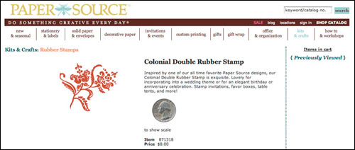
I found a floral stamp at The Paper Source for $8, photographed it, and bam, put some pretty font next to it and that was my logo. I put that stamp to good use and stamped floral patterns all over everything - stationery, envelopes, contracts, shipping labels.... I have to admit, I was pretty proud of myself for coming up with a design that had a somewhat DIY/custom feel and fit within our non-budget. I picked the brown and blue color scheme because blue was for Carolina blue (my alma mater), and I liked how brown complemented the blue.

At some point, I think around the beginning of 2010, Adm and I decided that we were ready to create a legitimate logo and identity that was a reflection of what we and our photography are about. We also decided that it was time to hire a professional to do this. This was kind of huge for us because it marked the first time that we were hiring other people to do work for the business. Up until this point, we had done everything ourselves, but we also realized our limitations, particularly the fact that we're not designers. We brainstormed moods, themes and adjectives that we wanted our logo to reflect - emotions that we wanted people to feel (either consciously or subconsciously) when they looked at our logo and our photographs. We did all kinds of exercises, like coming up with single sentences to describe our approach, creating a mission statement, outlining our long-term and short-term goals... Initially, I thought these exercises were kind of silly and a waste of time, but they're really not. They forced us to be able to articulate what we are about, our vision and what we want our clients' experience with Alison Yin Weddings to be. While we were doing this, I kept pulling design inspiration from the web and just putting all of that away in a folder for later use.
The next task (no small feat) was to find the right designer. We did have some restrictions - namely, our budget, and we wanted to work with someone local so we could be active and in-person participants. That, and we're also trying to support local businesses and services as much as possible. In researching graphic designers, I noticed there are lots of different types of designers - the three most obvious to me were designers who specialize in typography, others who specialize in collage and mixed media, and others who are illustrators. We wanted someone who could draw so we went the illustrator route. I realize that all of this must sound really elementary, but figuring out these basic principles literally took us months, so that just shows where we were coming from.
After several meetings with designers and countless hours looking through online portfolios, we finally stumbled upon Emma Robertson. At the time, Emma had just moved to Berkeley from Paris, one place that provided some major inspiration for the look I wanted to create. What sold me on Emma before even meeting with her was the personal work portion of her portfolio and her blog. Most of the time, graphic designers create work that reflect the vision of the people they're working for, so it's not really a true reflection of what their personal style is all about. I love Emma's illustrations and her use of color, AND her blog is full of things she likes and is drawn to - all things that were on the same wavelength as what I wanted.
Unfortunately for Emma, I basically just dropped my inspiration folder in her lap (there were at least 85 different photos of things), and told her to have at it. Here's a sampling of what I gave her:


Below is a smattering of things that I like that I gave Emma. I wanted her to create something that was pretty and elegant, but that also had a hand painted, whimsical and quirky feel with room to evolve over time. And obviously, as you can tell from just glancing at the images below, I love color so that was also key.
11/12 (a vase I brought back from Paris)/13
14 (a bag I brought back from a store in Paris)/15
For the next blog post, I'll write about the process of working with Emma and coming up with our new look.
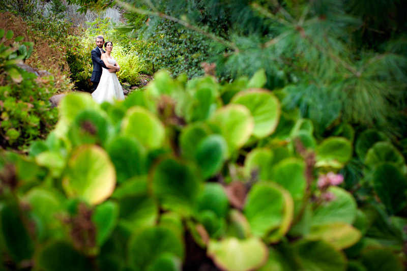 Wow, where to start with Aubra and Justin's wedding? Adm and I had had such a great time with these two during their engagement session, we knew their wedding was going to be really fun, but it completely exceeded our expectations. Let's start with Aubra. She was absolutely breathtaking! And her dress, well, let's just say I fell in love with her dress, which perfectly went with the feel of their wedding. And Justin looked very handsome as well and was, hands down, the star of the dance floor. Next time we have a party, we're totally inviting him to get people groovin'!
Now, moving onto the ceremony. Aubra and Justin were married in the Redwood Amphitheater at the UC Berkeley Botanical Gardens, and their ceremony was completely magical. For starters, Aubra seemed to appear as a fairy nymph coming out of the redwoods as she approached the stage to meet her groom. The image of her walking through the beautiful trees by herself might be my favorite from the whole day. They had a traditional Jewish ceremony and added in a lot of themselves and their friends to completely personalize it and include the people closest to them. As I looked around at all of the guests during the ceremony, every single person there seemed to be completely engaged in what was happening and full of genuine happiness and love for these two. What a privilege for us to be able to witness that!
The ceremony really set the tone for the rest of the day which continued with just as much love and beauty. In addition to being surrounded by so many people who loved them, part of what made Aubra and Justin's wedding so special was that it was a complete reflection of them as a couple. They were both equally involved in the planning process and because of that, they really made this their event. This seems so basic, but with lives being so busy today, often the wedding planning falls primarily on one person (the bride) who relies on help from her mom or close friends. I just loved that these two worked together to make this day truly theirs.
Following two photos and details by Adm:
The ketubah:
Photo below by Adm:
Photo below by Adm:
Photo below by Adm:
Photo below by Adm:
Next two photos by Adm:
Photo below by Adm:
Photo on the right by Adm:
Next two photos below by Adm:
Next two photos by Adm:
Photo below by Adm:
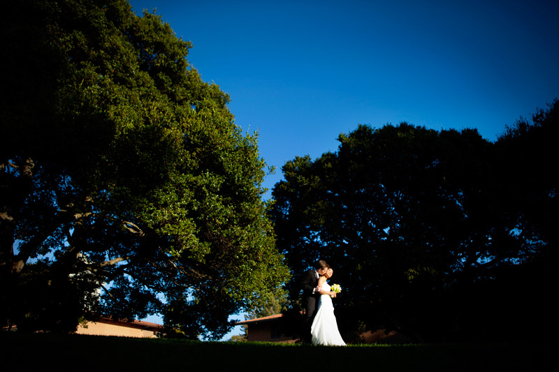 Erika and Colin had an incredible wedding at the UC Berkeley Faculty Club in August. They met while in undergrad at Cal and are fervent Bears fans (they attend Cal football games whenever they can) so this spot could not have been more fitting or perfect for them. Erika carried through the Cal theme with the colors, and so there were lots of blues and yellows which made the wedding bright and vibrant! Additionally, Erika's family is Filipino and her parents surprised the newlyweds with some traditional Filipino performances, which was a real treat for us! With backgrounds in photojournalism, Adm and I love photographing new (and ethnic) events with lots of color and dancing, and there was LOTS of dancing! Also, I've known Erika since middle school as we went to the same school through high school so it was really fun seeing lots of familiar faces (one of my dear friends Stephanie was a bridesmaid!).
I don't normally do this, but I've got to give a big shout out to Jane Kim, Erika's make-up and hair lady. Jane made all the girls look beautiful, AND she stayed right by their sides up through the ceremony! Erika and Colin, thanks so much for inviting us to share your special day, and we wish nothing but all good things to you for the future!
Next three photos by Adm:
Photo below by Adm:
Adm pre-planned and executed this portrait of Erika and Colin, and I have to say, I think it's one of my favorite portraits we've made this year!
Photo below by Adm:
Photo below by Adm:
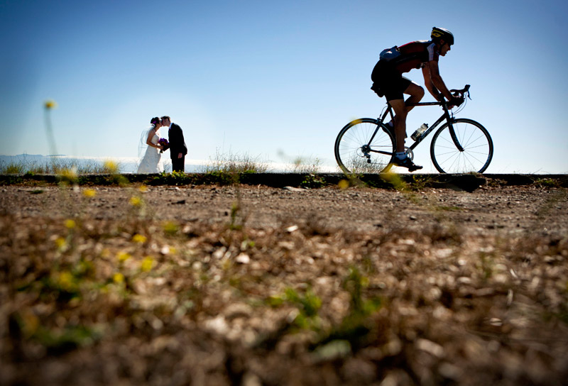 For the second time this summer, Adm and I found ourselves at the Brazilian Room in Berkeley for Katie and William's wedding. It's really such a lovely spot, up in the hills, away from city noise and traffic. Plus, I always love seeing how different couples transform places and create events to make them really feel their own. Katie and William were no exception and they carried through an Irish theme with a live band that played traditional Irish music, engaged in Irish dancing and created details that clearly were made with the touch of an Irish lass. Adm and I had such a wonderful time hanging out with Katie and William, who were just so genuinely nice throughout. I feel like I'm becoming a broken record when I say these were two of the nicest people we've photographed, but it's so true! We have been so lucky to have such nice and caring couples to work with!
Next two photos by Adm:
Photo below by Adm:
Photo below by Adm:
Photos below by Adm: